“Ask for advice” form is now on the site
Another nice little thing about the advice section that few people will appreciate (and that’s OK).
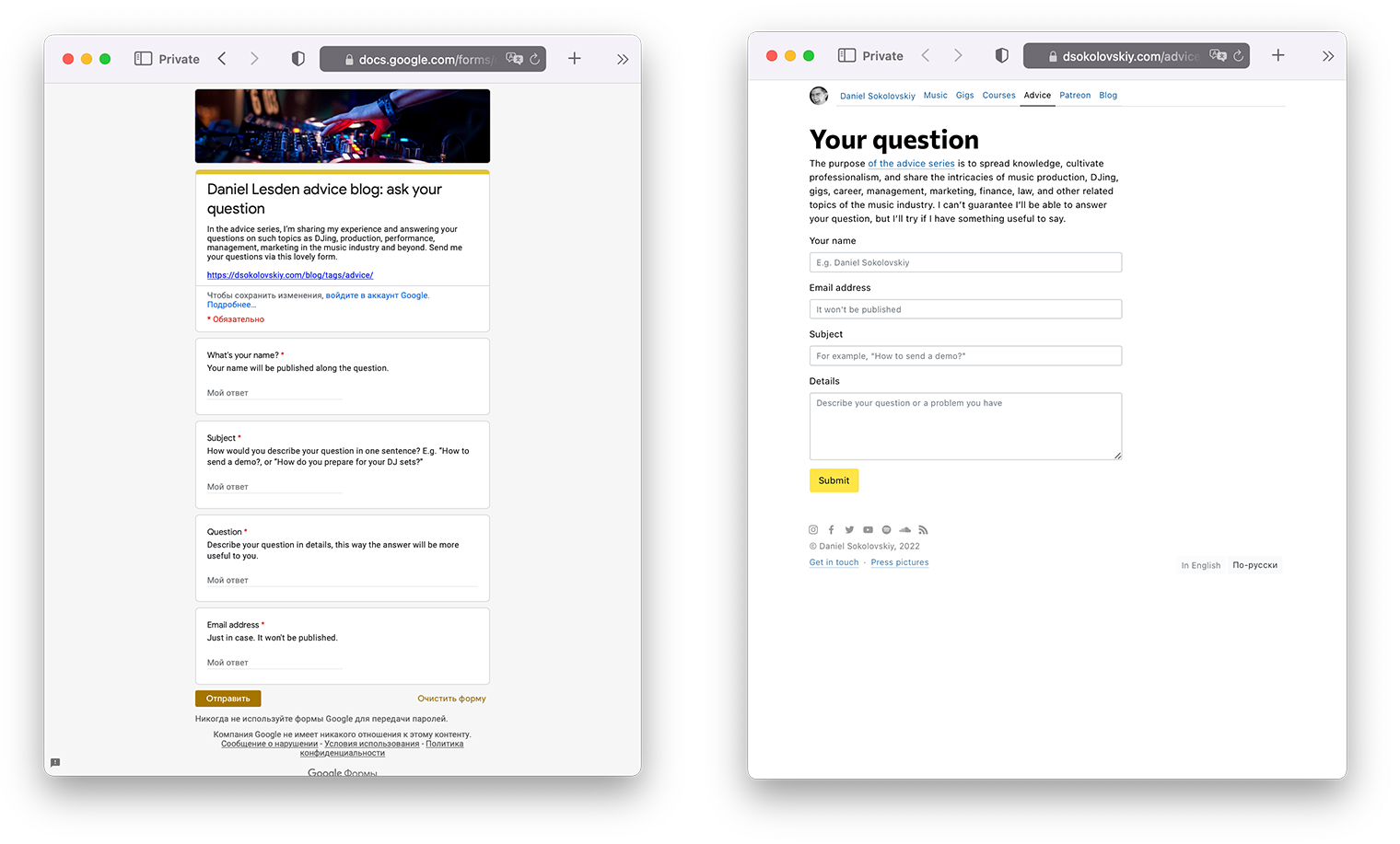
Before: the questions were asked through the Google form. Since it’s Google, it wasn’t pretty, and my inner sense of beauty suffered from it.
Now: the form is now on my site, it looks a hundred times cleaner and nicer.
Compare the two:

The best part is that the form on my site is actually the same Google Form, just designed in the site’s style. I didn’t even know you could do that, but it turns out you can! In this case, the good thing about having the Google Form “under the hood” is that I still have access to its features, such as the automatic collection of results in a spreadsheet, email notifications, and synchronization with my to-do list via Zapier (if you curious, I wrote about it here).
Developers will probably laugh because you could do all those things without Google under the hood. But I am not a programmer, so I am happy with what I can do on my own :-)


