An easy fix that would make iTunes better
I’m using iTunes for about six years now. It keeps my DJ music collection nice and organized and works as a central hub for all the music and podcasts.
But it has one major flaw.
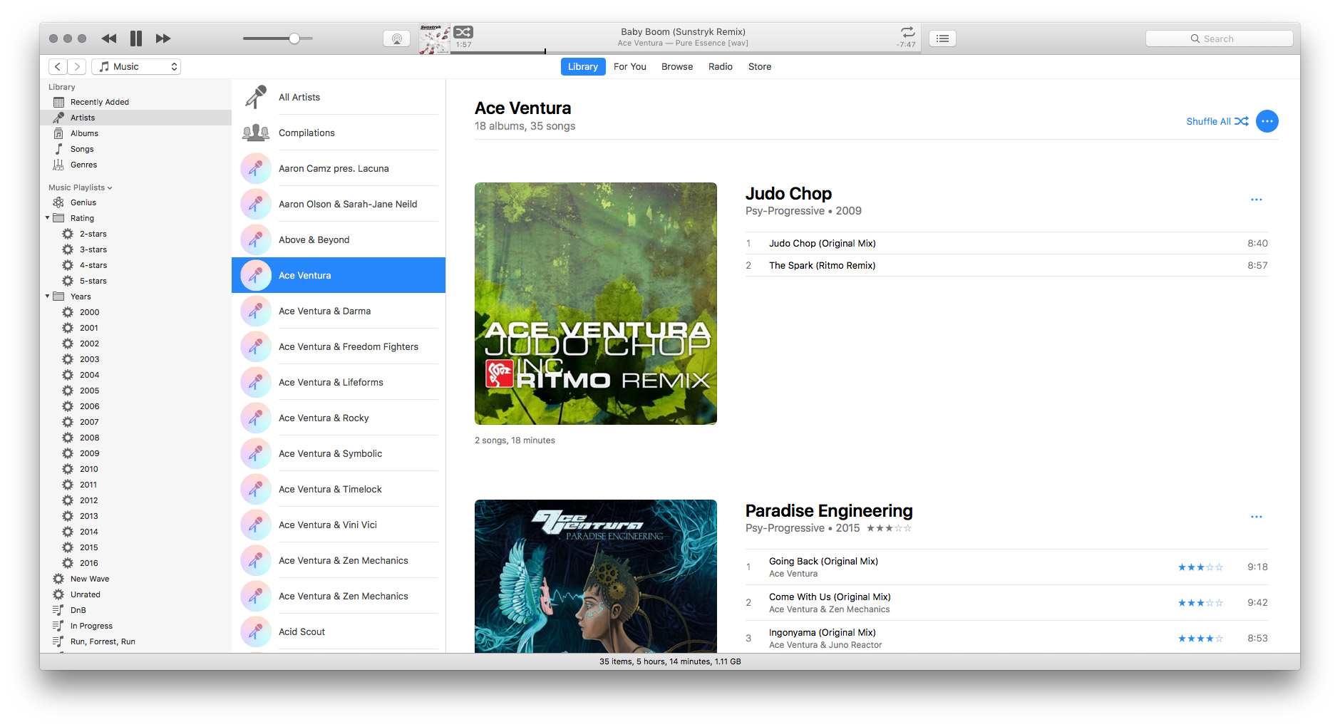
In electronic music, very often there are more than one producer stands behind the song, it’s called collaboration. The problem is there is no way to show this properly in iTunes. As a result, the “Artists” view looks like this:
What does “feat.”, “vs.” and “pres.” means

Look at the middle column. There are “Ace Ventura & Darma”, “Ace Ventura & Freedom Fighters”, “Ace Ventura & Lifeforms” etc, all as a separate entity in the library. This means if I would want to listen to the entire collection of tracks I have from Ace Ventura, I can’t just do this from the “Artists” view because half of his tracks are collaborations with other artists. And it pisses me off.
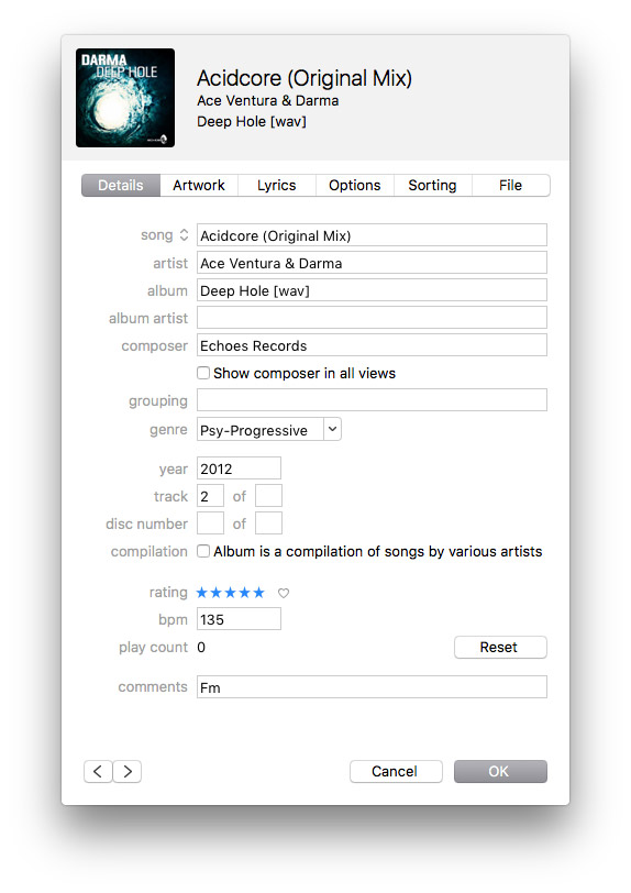
This happens because iTunes has only one “Artist” field with a single string of text:

And here is a simple way to fix this: just turn artist names into “tags”. Like this:

This way we could add multiple artists and finally browse songs properly in the “Artists” view.
I hope Apple will implement this someday, luckily significant changes in the UI are not required.