Website 4.0
Introducing a major website update

It’s easy to make something new, much harder task is to take an existed product and precisely improve every aspect of it. This is a huge update that changes pretty much everything, while overall look remains nearly the same. Like iPhone 6s.
Key highlights:
- More compact, simple, and neat design;
- Every section got an updated feel and look;
- Brand new section added, “Advice”: a new place for the weekly posts;
- Navigation menu got smooth animation.
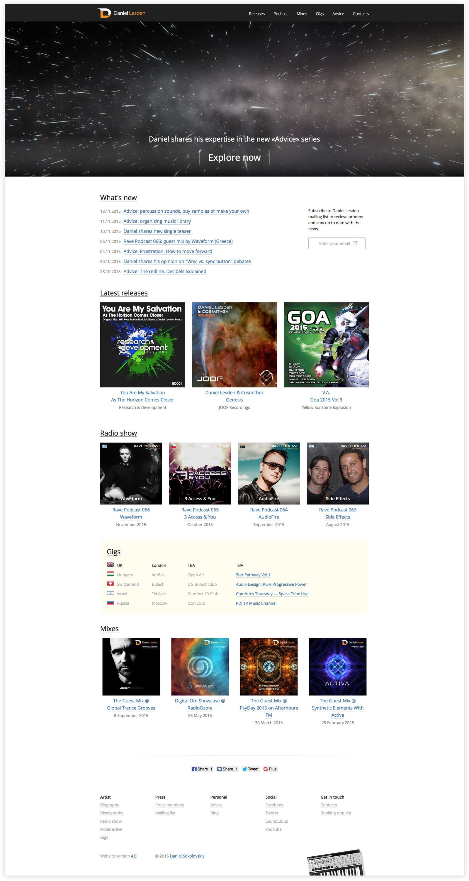
Home page:

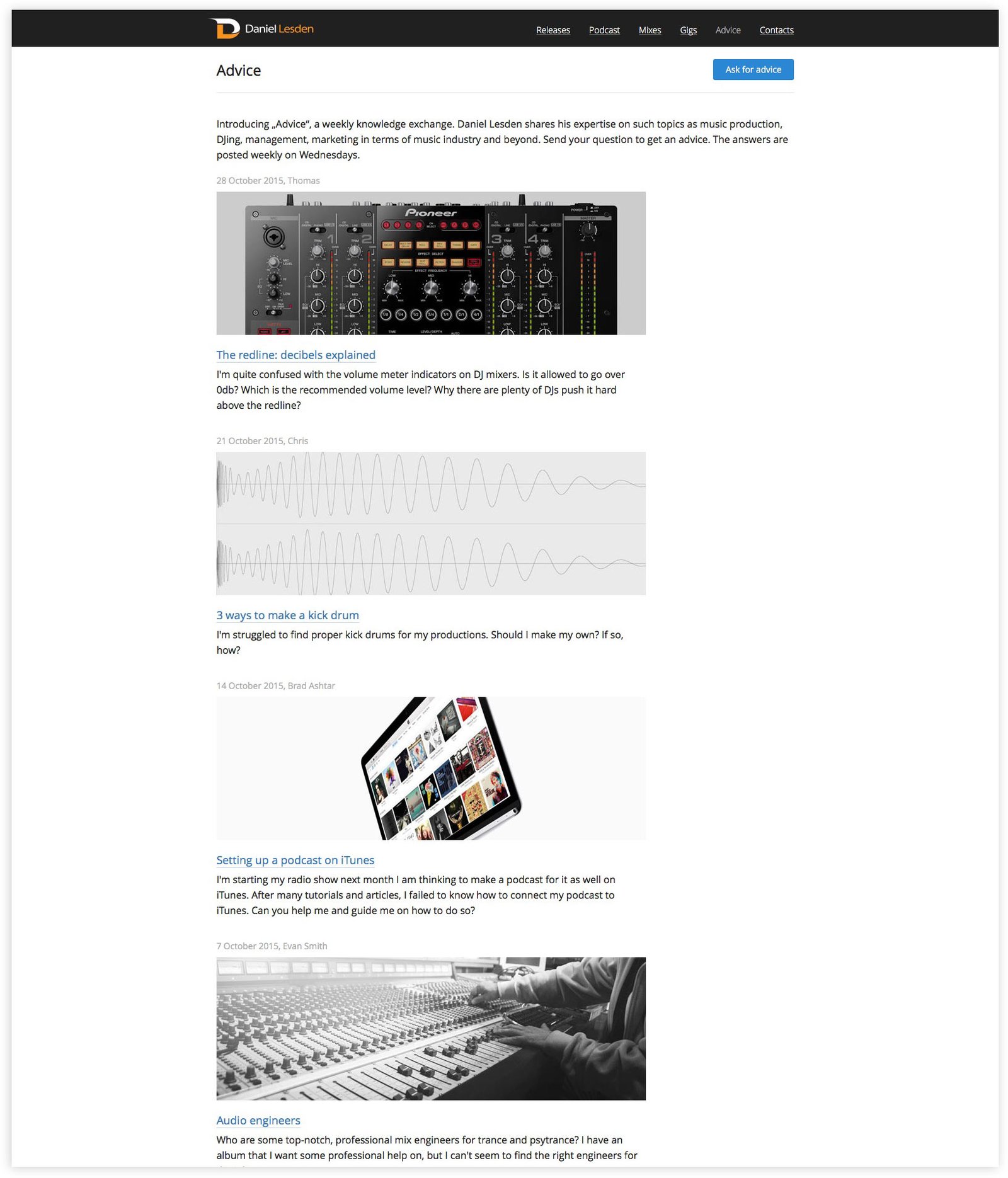
Brand new advice section:

Updated release page:

Updated press section:

Explore more: www.daniellesden.com
